YOU 2 YOU
Brand, Business Strategy, Website Design, Digital Marketing
The Challenge
We were approached by the owner of You 2 You for a logo initially. That logo turned into building a brand and experience. We jumped at the idea of a convenient, safe place to exchange items you purchase online. Except this service is for purchases made through classified advertisement websites, like Craigslist, LetGo, and OfferUp. We had to develop this brand and give people a place to go for purchases made online hundreds of thousands of times every day.
The Solution
We helped establish this brand as the go-to place for in-person transactions made through online classified advertisement websites. A logo became a brand; an experience.
Online to In-Store
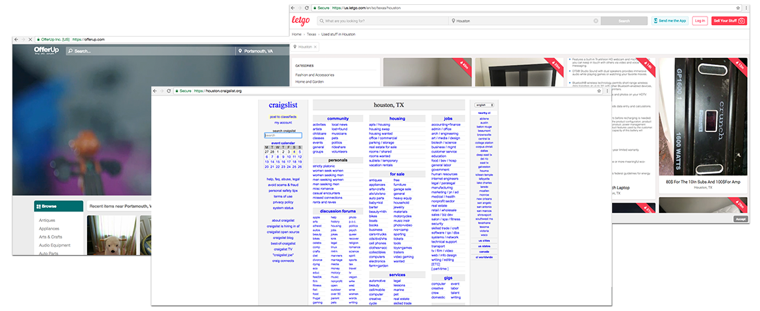
Classified Advertisements
Craigslist and other lead the market in online classified advertisements. We wanted to bridge the gap for the last step in the process. Where to meet up? By showing online purchasers how to connect to You 2 You.
Leveraging Active Users
With millions of people using classified websites daily we immediately saw potential for creating a streamlined process for You 2 You. Domestic and International opportunities existed because of the shear amount of people engaging in buying, selling, and trading.
Million Users
Billion Avg. Page Views
Million Ads Posted Monthly
Languages
Brand Marks
We explored options for a mark for You 2 You. We created a text-based logo and a symbol that expressed what You 2 You was. The symbol was based on the ‘U’ shape and the Roman numeral for the number ‘2’.


Collateral
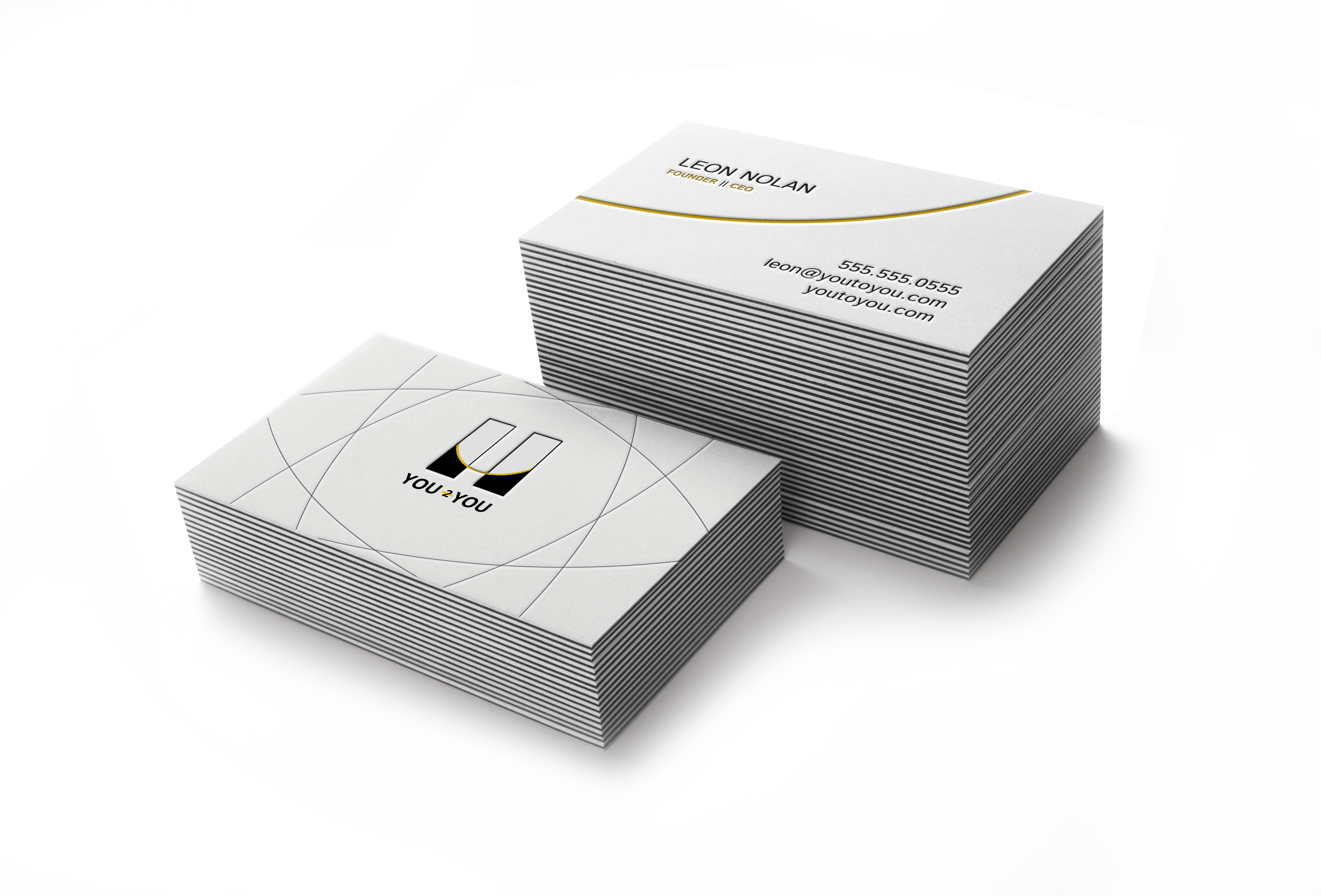
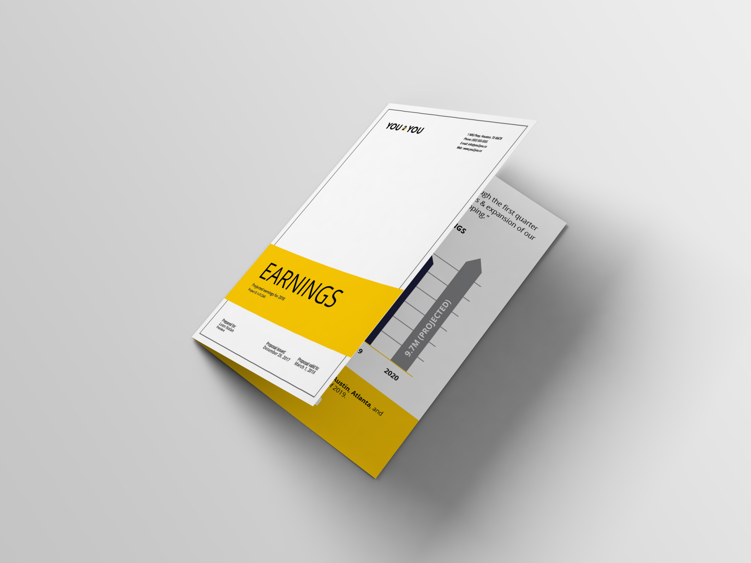
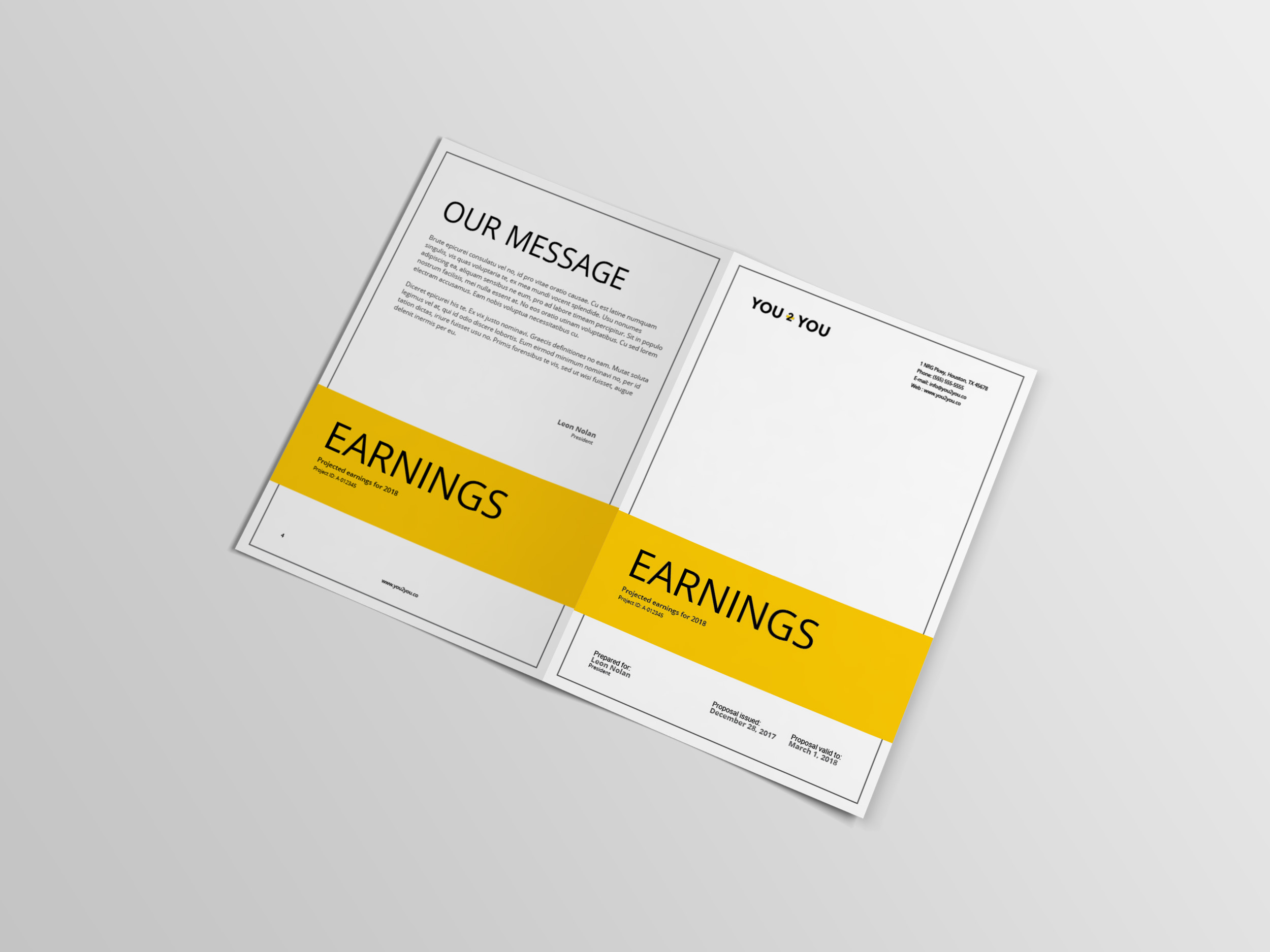
We carried the theme of You 2 You across each piece of collateral building a landscape of branded material. We wanted every aspect of the business to communicate the relationship between the user and company. The letterhead, business cards, and other collateral showcased various aspects of the design process including the brand mark, pattern, colors, and typeface.

Signage
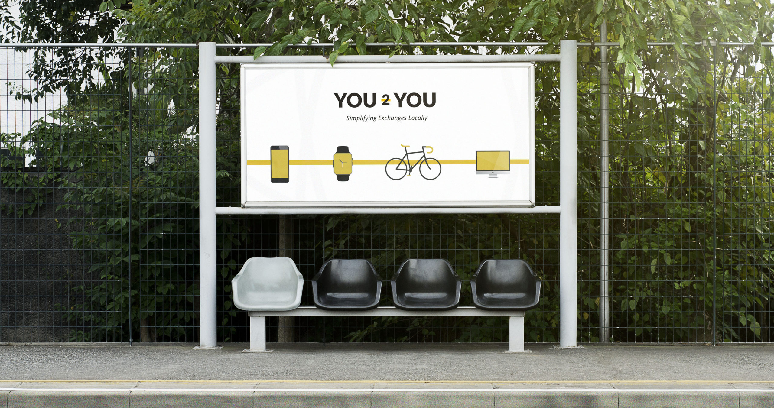
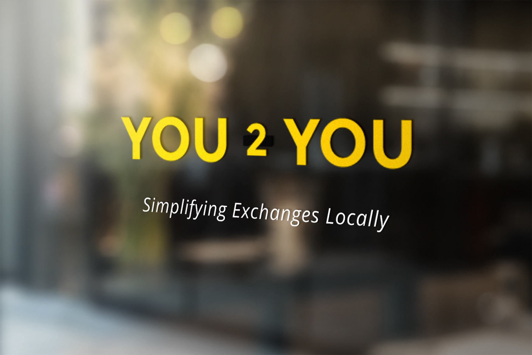
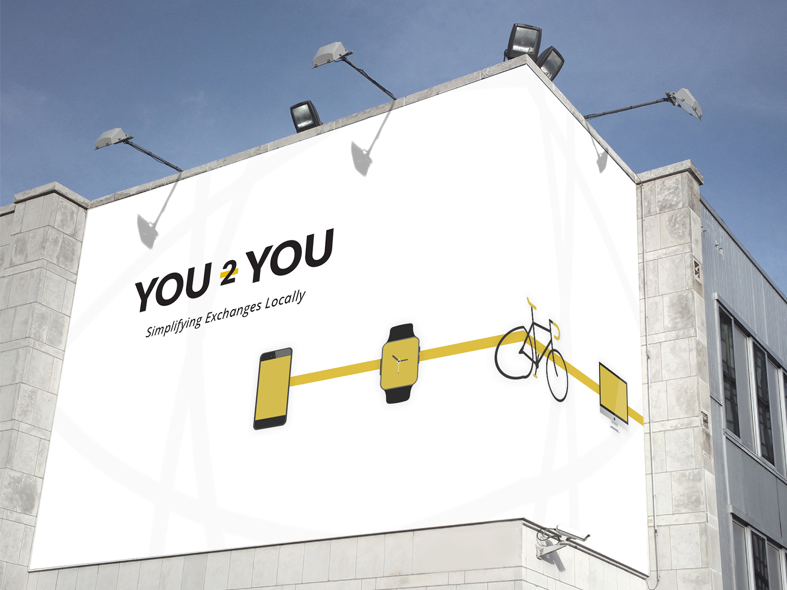
You 2 You needed a bold presence. We worked with the client to create recognizable signage from multiple touchpoints. From the front door and billboard, to the bus stop; we wanted You 2 You to stand out in the community.
Home Sweet Home
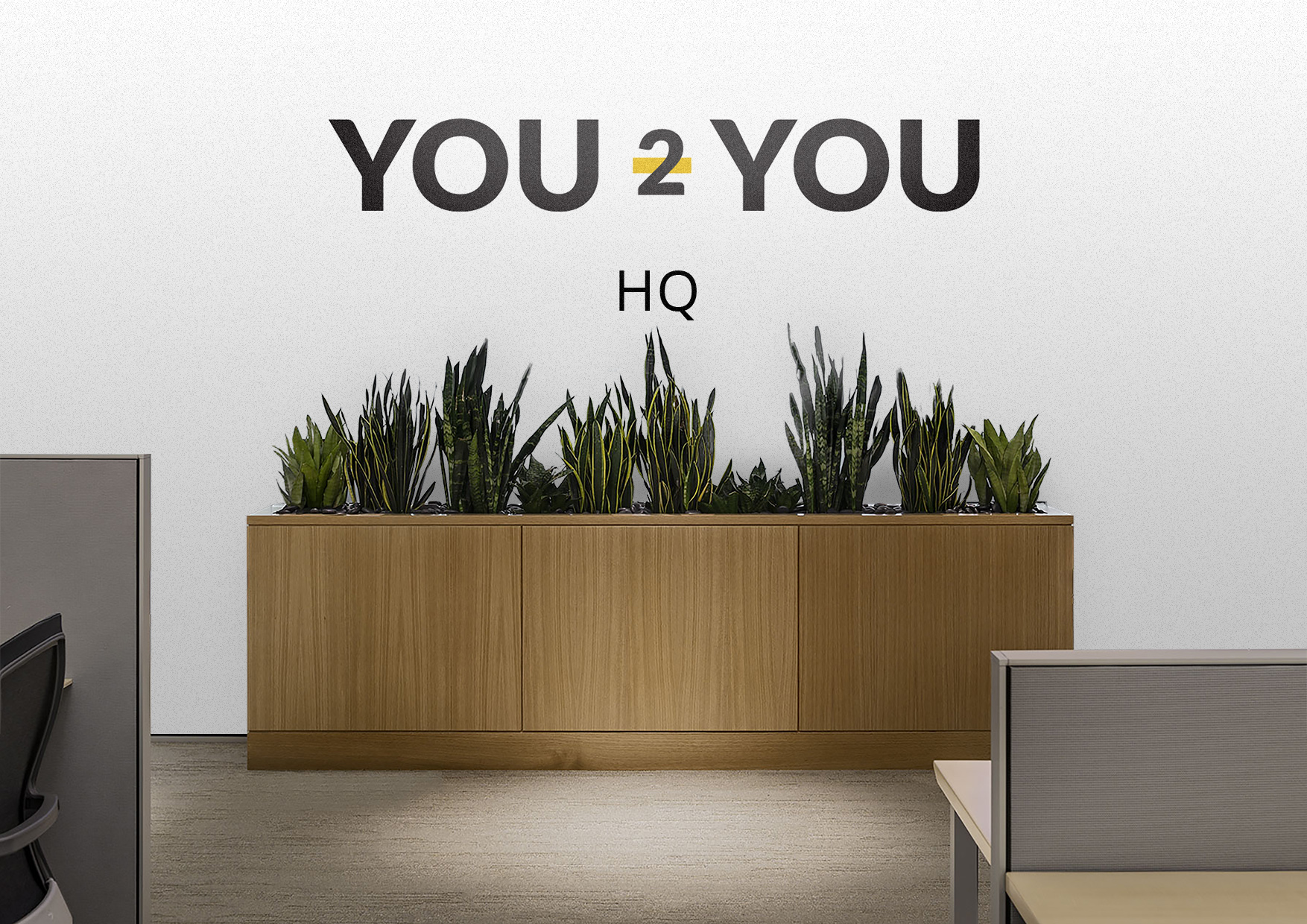
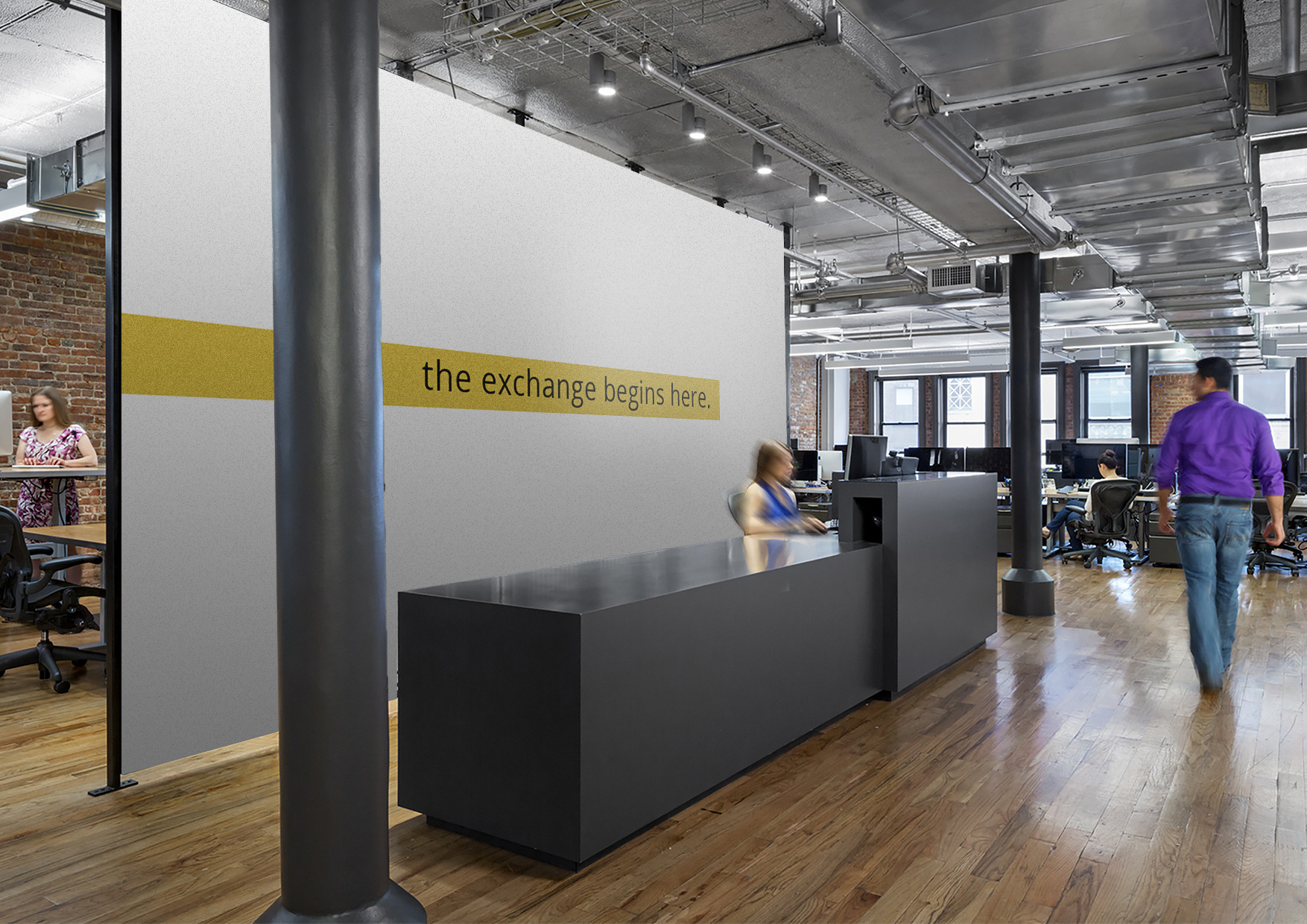
The experience was not complete until we made You 2 You headquarters look good. We brought the same visual identity back to the office. The minimalist aesthetic connects with one of the core focuses of the company. Simplicity.
Online Experience
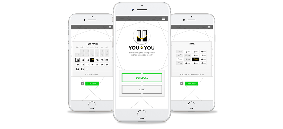
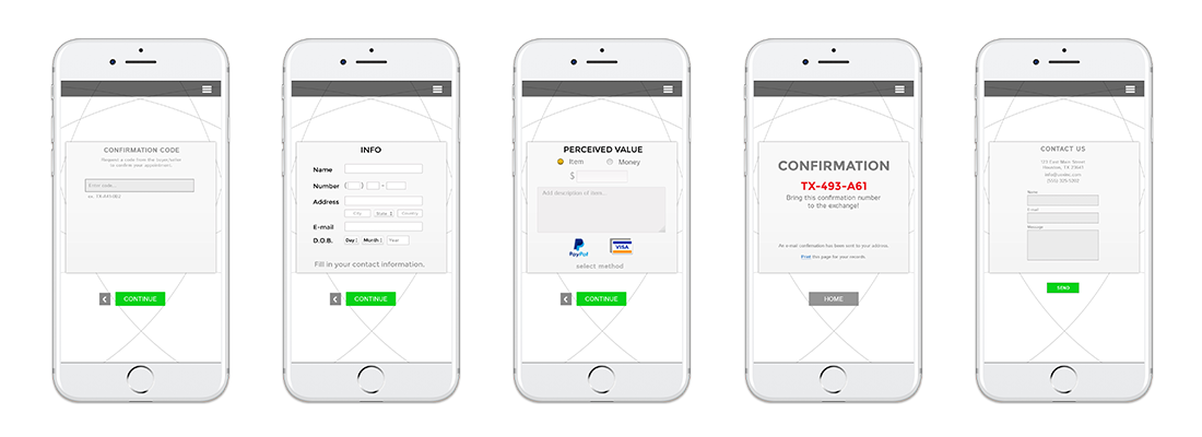
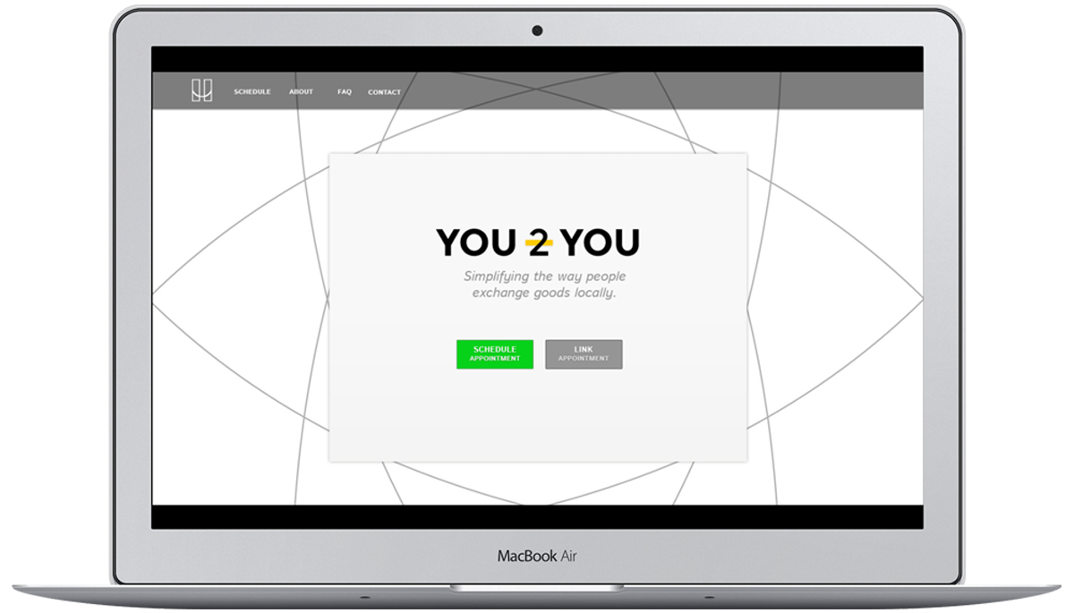
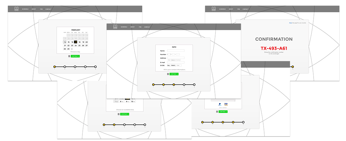
Creating a scheduling system for You 2 You was the most critical aspect of the project. We created a simple way to guide users into the appointment-based process in the store by asking them when they were free. Options for available dates and times are displayed so users know when they can come in to the store.
Streamlined Scheduling
We collaborated with the client to design a streamlined system online to funnel users through the scheduling process. What we came up with was a simple, step-by-step system to connect users to each other and the store.
Streamlined Scheduling
We collaborated with the client to design a streamlined system online to funnel users through the scheduling process. What we came up with was a simple, step-by-step system to connect users to each other and the store.
Online and Handheld
We created the mobile system in similar fashion as the desktop experience. The number of online transactions and interactions from mobile devices continues to grow year after year. We wanted to communicate to users through a simplified experience how we value their time and need to buy and sell their products.
